SalesMoose
Grow people grow sales

Client
SalesMoose
Task
Help salesmoose evolve as a brand from a startup to a scale-up business, by designing their complete brand identity and website
Role
Brand Design, Web Design & Development
Year
September 2018

The logo
Starting out as a brand new start up also means a new logo & brand identity. For the logo — obviously — we chose to use a moose as the base of the logo. The logo had to be modern but also classic, 'warm' and not too clean.
After several sketches of a moose we finally chose the current logo. You can also notice an upward direction in the antlers. This is representing the growth you'll see in the payoff 'grow people - grow sales'.
Brand guidelines
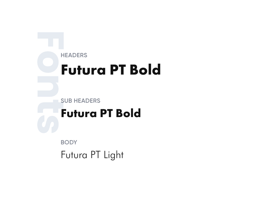
For the typography we have used the same typeface as used in the logo, the Futura PT.
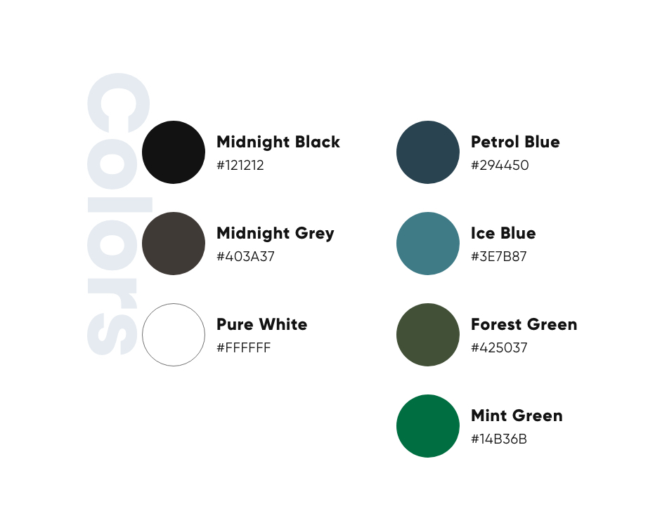
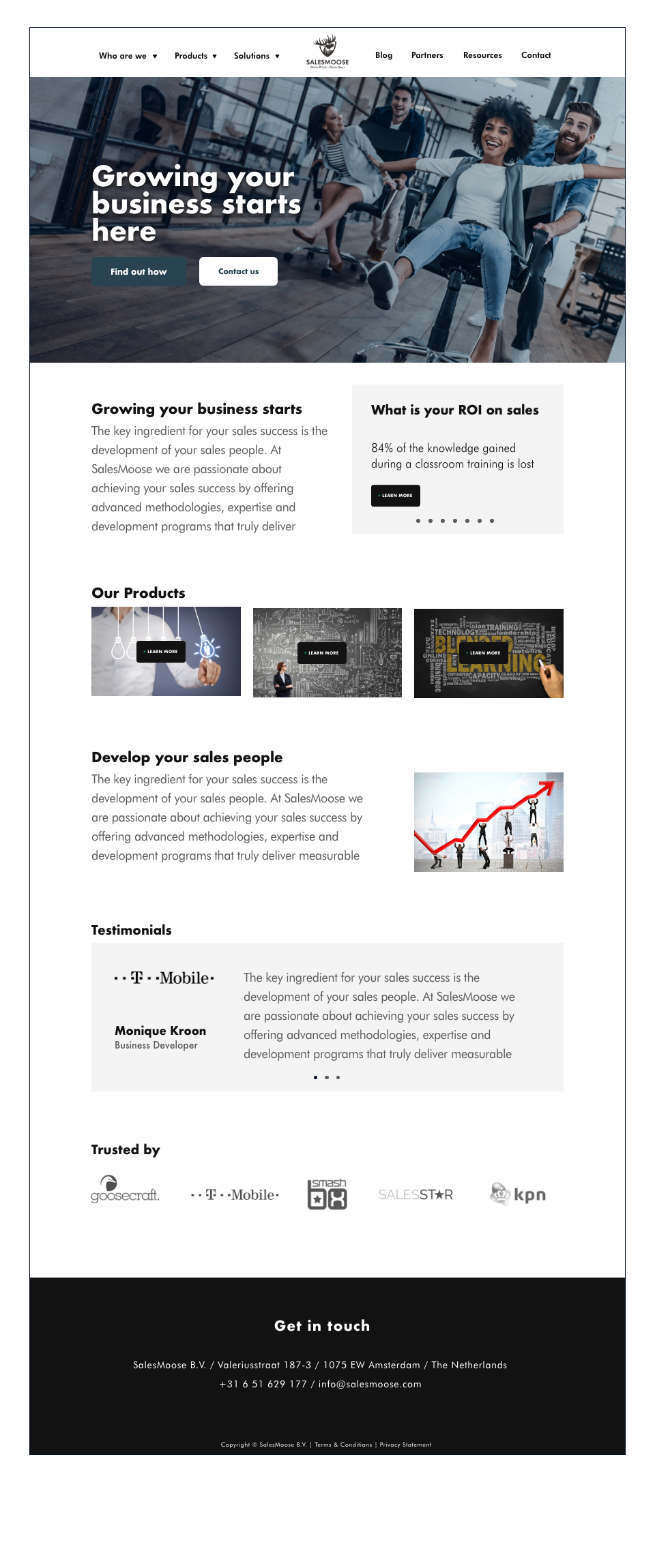
We have combined this with sophisticated, elegant, yet powerful colors, so that the brand has a distinguished but modern look and feel. Same goes for the photography, this also has a distinguished feel to it. And if possible always with people on it to make it more accessible for the audience.


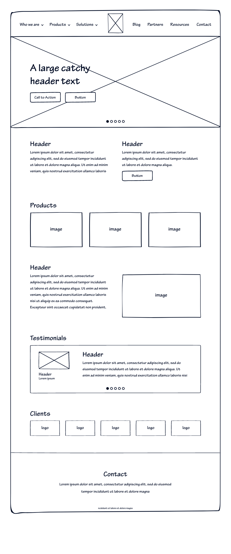
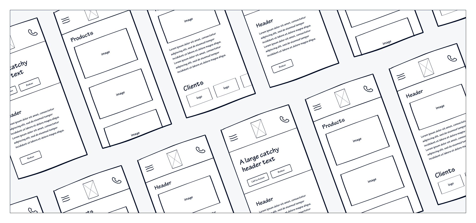
Mobile first
Of course the mobile experience is always a little different compared to the desktop experiece, but it still has to make sure that the user experiences the same emotions.
Whichever device is being used, the website always keeps the same features, content and animation styles.
Final thoughts
SalesMoose is developing and growing as a company, attracting and succefully helping more & more clients and they even moved to a larger office in the city center.
Of course this is mainly because of the quality they deliver and they focus they have on their business process, but we are happy and proud to be a part of this growth. A new fase is entering and that also means a renewed website. To be continued...